Exercise 15 - More plotting
Contents
Exercise 15 - More plotting
Andrew Valentine, Louis Moresi, louis.moresi@anu.edu.au
In this exercise, we will meet some more advanced features of Python’s plotting capabilities.
In matplotlib, a figure represents the entire ‘page’ you can draw on, and can contain multiple axes, each of which contains a single plot. This allows you to build up complex, multi-panel figures.
To understand how this works, it’s useful to go to the very-basics, and manually create a figure and an axis to make a plot in.
For example:
fig = plt.figure()  # creates a new figure, with no axes
ax = fig.add_axes([.1, .1, .8, .8])  # creates an axis at the specified coordinates
# the coordinates are in the form [left, bottom, width, height].
# Units are fractions of the total figure size (i.e. 0.5 is the centre of the figure).

ax.plot(x, y)  # draws a plot on the axis
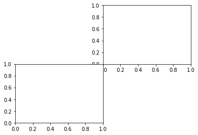
➤ Make a new figure containing two axes - one in the upper right quarter, and one in the lower left quarter.
# Try it here!
fig = plt.figure()
ax1 = fig.add_axes([.5, .5, .4, .4])
ax2 = fig.add_axes([.1, .1, .4, .4])
This is straightforward, but can get laborious if you’re making a plot with lots of panels. Luckily, matplotlib has a number of built-in functions that make creating multi-plot figures very easy.
For simple cases where you want an \(N \times M\) grid of plots, you can use fig.add_subplot():
fig = plt.figure()
fig.add_subplot(nrows, ncols, index)
where nrows is the number of ‘rows’ in the grid, ncols is the number of columns, and index is a number between 1 and nrows*ncols which selects which of the panels we wish to create. Typically, one will call fig.add_subplot() several times, with the same nrows and ncols, but a different index in each case. Having switched to a panel, we can then issue plotting commands for that panel.
As a shorthand, if nrows, ncols and index are all single-digit numbers, you can also call fig.add_subplot(nci) where nci is nrows, ncols and index concatenated into a 3-digit number. In other words, fig.add_subplot(3,2,5) is exactly the same as fig.add_subplot(325).
For example:
fig = plt.figure(figsize=(12,3))
xx = np.linspace(0,1,100)
ax1 = fig.add_subplot(1, 2, 1)
ax1.plot(np.sin(5*np.pi*xx),'r')
ax2 = fig.add_subplot(122)
ax2.plot(np.cos(5*np.pi*xx),'b')
Also notice here that we have passed figsize = (xsize, ysize) to plt.figure(), to control the size (and more importantly, shape) of the figure we have created. Note: figure sizes are in inches.
➤ Use fig.add_subplot() to make a new figure with the same layout as the one above.
# Try it here!
fig = plt.figure()
fig.add_subplot(2, 2, 2)
fig.add_subplot(2, 2, 3)
<matplotlib.axes._subplots.AxesSubplot at 0x7fc026d0e0b8>
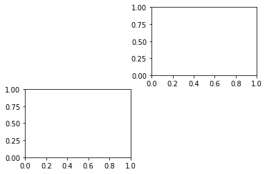
Notice how matplotlib has put some space between the axis automatically here, making for a nicer-looking plot.
Alternatively, you can create all the axes you need when you create the figure, using plt.subplots(nrows, ncol). This returns two objects - a figure, and an array of axes objects. For example:
fig, axs = plt.subplots(2, 2, figsize=[6, 6])
will create a figure object (fig), and a (2x2) array of axes (axs).
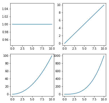
This can be really useful if you’re creating plots programmatically, as it creates all the axes at the start, and you can them iterate through them. For example:
fig, axs = plt.subplots(2, 2, figsize=[6, 6])

x = np.linspace(0, 10, 100)
for i, ax in enumerate(axs.flatten()):
    ax.plot(x, x**i)
Note the use of .flatten(), to convert a 2x2 array into a 1D array, which is more suitable for iteration.
➤ Try making this plot.
# Try it here!
fig, axs = plt.subplots(2, 2, figsize=[6, 6])

x = np.linspace(0, 10, 100)
for i, ax in enumerate(axs.flatten()):
    ax.plot(x, x**i)
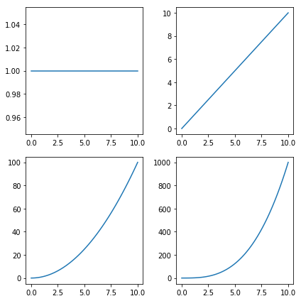
You’ll probably notice that a lot of the labels are overlapping, which doesn’t look great. You can deal with this using the really handy function fig.tight_layout(). This automatically resizes all the panels so that axis labels and legends don’t overlap, and the panels make the best use of all available space in the figure. Using this command at the end of any plotting script will ensure your figures are as beautiful as possible!
➤ Make the plot again, but run fig.tight_layout() at the end.
# Try it here!
fig, axs = plt.subplots(2, 2, figsize=[6, 6])

x = np.linspace(0, 10, 100)
for i, ax in enumerate(axs.flatten()):
    ax.plot(x, x**i)

fig.tight_layout()
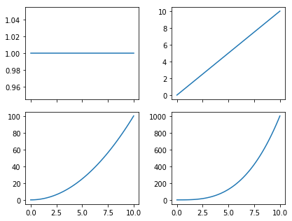
One final thing to notice here - all panels in this plot share the same x-axis, so plotting it on the top row isn’t very space-efficient…
➤ Try setting the sharex argument of plt.subplots to True.
# Try it here!
fig, axs = plt.subplots(2, 2, figsize=[6, 4.5], sharex=True)

x = np.linspace(0, 10, 100)
for i, ax in enumerate(axs.flatten()):
    ax.plot(x, x**i)

fig.tight_layout()
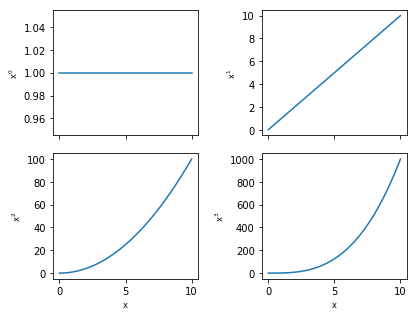
At this point, hopefully you’re getting the idea that there are both figure and axes objects, which do quite different things. In general, actions performed on an axis will only influence that axis, while actions performed on the figure can influence all axes within it, or create new axes.
Just one final thing to complete this plot - axis labels! This is done within the axes objects, as the labels relate to each panel individually. The specific functions you’ll need are ax.set_xlabel() and ax.set_ylabel(). axes objects have a wide range of ax.set_*() methods, which can modify their appearance. It’s worth having a look at these to be aware of what’s possible (type ax.set_ and press Tab to see a list of possibilities).
Before you set the axis labels, there’s a potential problem here - we’ve removed the x labels from the top row of plots… How can we deal with this? One of the benefits of using matplotlib’s functions for arranging axes on a plot, is that each axis object is ‘aware’ of where it is. For example, the method ax.is_last_row() might be useful here.
➤ Within the loop, label the x axis of the bottom row with \(x\), and the y-axis of every panel with \(x^i\)
# Try it here!
fig, axs = plt.subplots(2, 2, figsize=[6, 4.5], sharex=True)

x = np.linspace(0, 10, 100)
for i, ax in enumerate(axs.flatten()):
    ax.plot(x, x**i)
    if ax.is_last_row():
        ax.set_xlabel('x')
    ax.set_ylabel('$x^{:}$'.format(i))

fig.tight_layout()
Review: Multi-Panel Plots
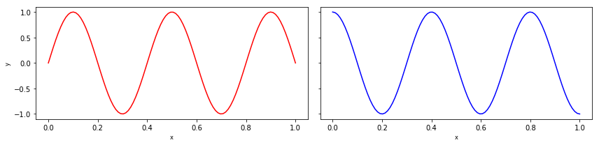
Make a plot that is 12 inches wide and 3 inches tall containing 2 axes on the left and right, with a shared y-scale.
Create an
xvariable with 100 points between 0 an 1.On the left axis, plot the function \(y = \sin(5 \pi x)\) with a red line.
On the right axis, plot the function \(y = \cos(5 \pi x)\) with a blue line.
Label the y-axis of the left panel ‘y’.
Label the x-axes of both panels ‘x’
# Try it here!
fig, (ax1, ax2) = plt.subplots(1, 2, figsize=[12, 3], sharey=True)

x = np.linspace(0, 1, 100)
ax1.plot(x, np.sin(5 * np.pi * x), c='r')
ax2.plot(x, np.cos(5 * np.pi * x), c='b')

ax1.set_ylabel('y')
ax1.set_xlabel('x')
ax2.set_xlabel('x')

fig.tight_layout()
import numpy as np
import matplotlib.pyplot as plt
%matplotlib inline
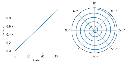
Projections & Coordinate Systems
So far, we’ve been working in simple cartesian (x, y) coordinates. In science, you might come across data than needs to be represented in other coordinate systems, for example polar (radius, angle) coordinates.
matplotlib can handle different coordinate systems using the projection argument when creating an axis. For example:
fig = plt.figure()

# create a panel with a polar projection
ax = fig.add_subplot(111, projection='polar')

# draw a spiral!
n = 1000
theta = np.linspace(0, 10 * np.pi, n)
radius = np.linspace(0, 1, n)
ax.plot(theta, radius)

# mofdify plot appearance
ax.set_theta_zero_location('N')
ax.set_rticks([])
Notice we’re using ax.set_theta_zero_location() and ax.set_rticks([]) to modify the appearance of the plot. Can you work out what these do?
➤ Create a figure with two panels showing the same data. The right panel should have a polar projection.
# Try it here!
fig = plt.figure(figsize=[6, 3])

# create a panel with a polar projection
ax = fig.add_subplot(122, projection='polar')

# draw a spiral!
n = 1000
theta = np.linspace(0, 10 * np.pi, n)
radius = np.linspace(0, 1, n)
ax.plot(theta, radius)
ax.set_theta_zero_location('N')  # set location of 0 degrees ('North' = top)
ax.set_rticks([])  # remove radial labels

ax2 = fig.add_subplot(121)
ax2.plot(theta, radius)
ax2.set_xlabel('theta')
ax2.set_ylabel('radius')

fig.tight_layout()
Annotations
Often, plots neet annotations to make sense. matplotlib has a number of tools to do this. The most useful ones are ax.text(), which you can use to add text to a plot, and ax.annotate(), which can be used to add a variety of text, arrows and other symbols.
For example:
fig, ax = plt.subplots(1, 1)

xx = np.linspace(0, 2*np.pi, 1000)
ax.plot(xx,np.sin(5*xx),'b')

ax.text(3, 0, 'some text')
ax.annotate('an annotation', xy=(4, .2))
# Try it here!
These commands have a number of other options, which alter their behaviour. The example above places the text using the same (x,y) coordinates as the data. If we want to place an annotation at the same position on each plot, this is impractical, and we should use fractional coordinates of the axis itself, instead of the data coordinates.
You can do this in both annotate and text:
ax.text(.2, .2, 'some text', transform=ax.transAxes)
ax.annotate('an annotation', xy=(.6, .6), xycoords='axes fraction')
You might also want to change the position of this text relative to the specified coordinates. For example, you want the text ‘anchored’ to the (x, y) position on its lower left corner. Do this by specifying the verticalalignment and horizontalalignment parameters (va and ha for short).
ax.text(.5, .5, 'some text', transform=ax.transAxes, ha='left', va='bottom')
ax.annotate('an annotation', xy=(.5, .5), xycoords='axes fraction', ha='right', va='top')
Finally, you can draw more complicated annotations using annotate, for example arrows with labels:
ax.annotate('an arrow!', xy=(.5, .5), xytext=(.7,1.15),
            arrowprops=dict(arrowstyle="->",
                            connectionstyle="arc3"),
            fontsize=12)
➤ Create a figure with a plot of \(y = x^2\), from x=-5 to x=5. Draw an arrow pointing to the minimum, with a label in the middle of the plot.
# Try it here!
Another really important type of annotation is a figure legend. matplotlib can automatically create legends if you specify the label='text' argument when drawing a line. For example:
fig, ax = plt.subplots()

x = np.linspace(0, 4 * np.pi, 100)
ax.plot(x, np.sin(x), label='sin(x)')
ax.plot(x, np.cos(x), label='cos(x)')

ax.legend()  # this creates a figure legend
➤ Create a plot showing \(A = x\) and \(B = 0.8 * x + 10\), with a figure legend.
# Try it here!
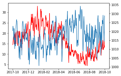
Real-World Data: Canberra Weather
The file CanberraBOMweather.xls is an Excel spreadsheet containing one year of daily weather data in Canberra, obtained from the Bureau of Meteorology.
➤ Load this data into a pandas dataframe
# Try it here!
import pandas as pd
dat = pd.read_excel('CanberraBOMweather.xls', skiprows=7)
➤ Produce a plot showing daily mean temperature and pressure as a function of time.
You should average the 9am and 3pm pressure readings for each day.
Think about the absolute values of these data - should they be on the same, or separate y axes?
# Try it here!
temp = (dat.loc[:, '9am Temperature (°C)'] + dat.loc[:, '3pm Temperature (°C)']) / 2
pres = (dat.loc[:, '9am MSL pressure (hPa)'] + dat.loc[:, '3pm MSL pressure (hPa)']) / 2

fig, ax = plt.subplots(1, 1)

ax.plot(dat.Date, temp, c='r')

pax = ax.twinx()
pax.plot(dat.Date, pres)
[<matplotlib.lines.Line2D at 0x7fc024e93208>]
The function plt.fill_between() provides a way to shade in a region of your figure. Use this to show the maximum and minimum temperatures each day on your graph. Make sure that the mean temperature and pressure information is not obscured! (Hint: the alpha parameter sets the transparrency of a line)
# Try it here!
temp = (dat.loc[:, '9am Temperature (°C)'] + dat.loc[:, '3pm Temperature (°C)']) / 2
pres = (dat.loc[:, '9am MSL pressure (hPa)'] + dat.loc[:, '3pm MSL pressure (hPa)']) / 2

fig, ax = plt.subplots(1, 1)

ax.plot(dat.Date, temp, c='C1')

ax.fill_between(dat.loc[:, 'Date'].values,
                dat.loc[:, '9am Temperature (°C)'].values,
                dat.loc[:, '3pm Temperature (°C)'].values, color='C1', alpha=0.5)

pax = ax.twinx()
pax.plot(dat.Date, pres, alpha=0.7)
[<matplotlib.lines.Line2D at 0x7fc0248192b0>]
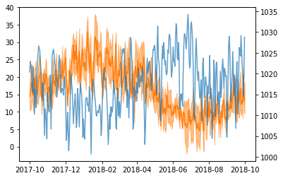
It’s clear that temperature and pressure are correlated.
➤ Produce a scatter-plot showing daily mean temperature vs. pressure.
# Try it here!
temp = (dat.loc[:, '9am Temperature (°C)'] + dat.loc[:, '3pm Temperature (°C)']) / 2
pres = (dat.loc[:, '9am MSL pressure (hPa)'] + dat.loc[:, '3pm MSL pressure (hPa)']) / 2

fig, ax = plt.subplots(1, 1)

ax.scatter(temp, pres)
ax.set_ylabel('Pressure')
ax.set_xlabel('Temperature')
Text(0.5,0,'Temperature')
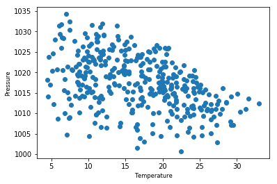
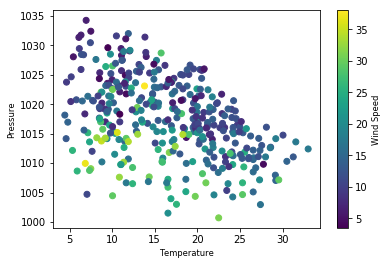
You should see a negative correlation between Temperature and Pressure. Wind speed might also be important here… is there more of a relationship between wind and temperature, or wind and pressure? Let’s have a look!
Do this by colouring the points by wind speed. (Note: before calculating the average wind speed, you’ll need to replace ‘Calm’ with 0 in the wind speed data).
You can colour points according to a variable using the c parameter, for example:
fig, ax = plt.subplots(1, 1)
ax.scatter(x, y, c=z)
# Try it here!
temp = (dat.loc[:, '9am Temperature (°C)'] + dat.loc[:, '3pm Temperature (°C)']) / 2
pres = (dat.loc[:, '9am MSL pressure (hPa)'] + dat.loc[:, '3pm MSL pressure (hPa)']) / 2

dat.replace('Calm', 0, inplace=True)
wind = (dat.loc[:, '9am wind speed (km/h)'] + dat.loc[:, '3pm wind speed (km/h)']) / 2

fig, ax = plt.subplots(1, 1)

ax.scatter(temp, pres, c=wind)
ax.set_ylabel('Pressure')
ax.set_xlabel('Temperature')
Text(0.5,0,'Temperature')
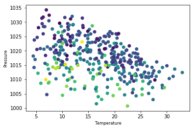
Now you need a way of telling someone what the colour means - a colour bar! This is adding a new element to the figure, rather than the axis, so you need to do this at the figure level (fig.colorbar()). Because the figure can contain multiple axes, you also need to tell the command what it’s drawing the colourbar for. For example:
fig, ax = plt.subplots(1, 1)
cb = ax.scatter(x, y, c=z)  # assign your coloured points to a variable
fig.colorbar(cb, label='z')
# Try it here!
temp = (dat.loc[:, '9am Temperature (°C)'] + dat.loc[:, '3pm Temperature (°C)']) / 2
pres = (dat.loc[:, '9am MSL pressure (hPa)'] + dat.loc[:, '3pm MSL pressure (hPa)']) / 2

dat.replace('Calm', 0, inplace=True)
wind = (dat.loc[:, '9am wind speed (km/h)'] + dat.loc[:, '3pm wind speed (km/h)']) / 2

fig, ax = plt.subplots(1, 1)

cb = ax.scatter(temp, pres, c=wind)
fig.colorbar(cb, label='Wind Speed')

ax.set_ylabel('Pressure')
ax.set_xlabel('Temperature')
Text(0.5,0,'Temperature')