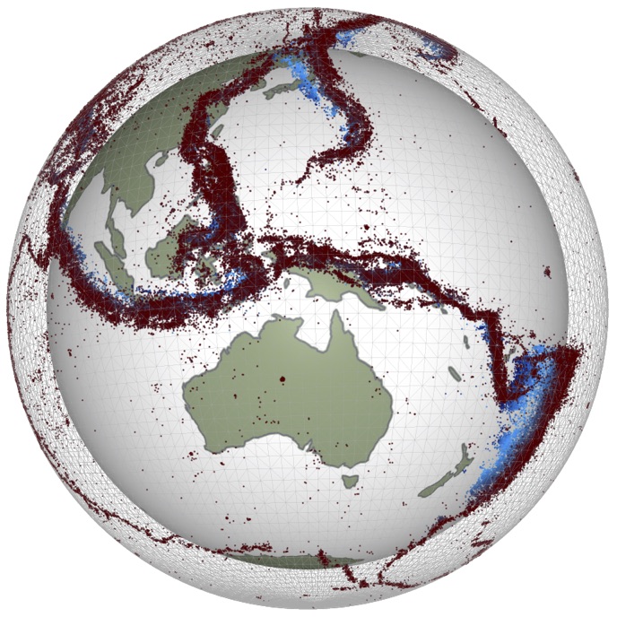
Lab - New Zealand Earthquake Data#
This is a notebook to view seismic data from the Ru network of school seismometers in New Zealand. The details are described in our manuscript published in the European Journal of Physics, in 2017. These data are from an earthquake in Rotorua, NZ, in 2016:
We can import some of the familar toolkits we have been using already such as Obspy to analyze seismic data.
#you can use these libraries by refering to their appreviation plt., np., pd. or ccrs
#basic plotting library
import matplotlib.pyplot as plt

#scientifc computing library
import numpy as np

#data analysis tool
import pandas as pd

#mapping toolkit
import cartopy.crs as ccrs
import cartopy

#seismic toolkit
import obspy
#Try it here!


#you can use these libraries by refering to their appreviation plt., np., pd. or ccrs
#basic plotting library
import matplotlib.pyplot as plt

#scientifc computing library
import numpy as np

#data analysis tool
import pandas as pd

#mapping toolkit
import cartopy.crs as ccrs
import cartopy

#seismic toolkit
import obspy
# Provide the actual parameters of the earthquake from the GeoNet website (in Lab7 document)

from obspy.core.utcdatetime import UTCDateTime
t0 =  UTCDateTime("2015-09-23 18:47:51")
lat= 0
lon= 0
depth= 0 # in km
# read and plot the seismic data from the S data up to 250 seconds after the origin time:
%matplotlib inline
import matplotlib.pyplot as plt
plt.rcParams.update({'font.size': 18})
from obspy import read

#this URL is the location of all the data you need - Python will grab it for you
st = read('https://ndownloader.figshare.com/files/6924224')
st.trim(t0,t0+250,pad=True,fill_value=0)
fig = plt.figure(figsize=(25, 10))
st.plot(fig=fig,norm_method='trace')
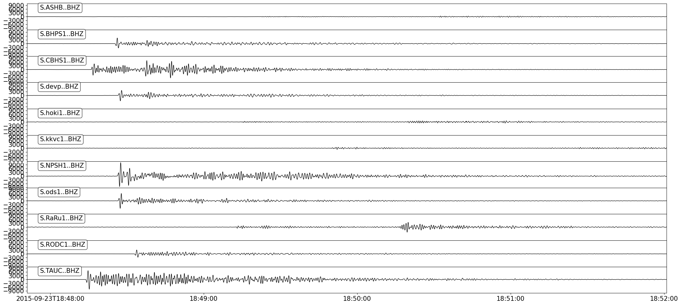
Note the difference in amplitude and arrival times in these seismograms. Generally, later arrivals and smaller amplitudes mean a greater distance between earthquake and seismometer! But let’s be a bit more precise. The cell below computes the travel times for primary and secondary waves as a function of distance to the earthquake. The predictions are based on an Earth that is perfectly spherically symmetric. In this case, we will use a 1D velocity model of the Earth called IASP91 which was developed by Professor Kennett here at RSES.
For more information: http://ds.iris.edu/spud/earthmodel/9991809
# Compute travel times based on the IASP91 model:

from obspy.taup import TauPyModel
import numpy as np

model = TauPyModel(model="iasp91")
phases = ['p','P','s','S']
min_degree=0
max_degree=10
npoints=500
data={}
degrees = np.linspace(min_degree, max_degree, npoints)

for degree in degrees:
    tt = model.get_travel_times(distance_in_degree=degree, source_depth_in_km=depth,phase_list=phases)
    for item in tt:
        phase = item.phase.name
        if phase not in data:
            data[phase] = [[], []]
        data[phase][1].append(item.time) # in seconds
        data[phase][0].append(degree)
Now let us plot these arrival time predictions (as lines) over the seismic data:
data.keys()
dict_keys(['P', 'S'])
# add lat, lon, and epicentral/angular distance to each trace
from obspy.core.util.attribdict import AttribDict
from obspy.geodetics import locations2degrees

fig = plt.figure(figsize=(25, 10))
for tr in st:
    tr.stats["coordinates"] = {}
    tr.stats.coordinates.latitude = tr.stats.sac.stla
    tr.stats.coordinates.longitude = tr.stats.sac.stlo
    tr.stats.network='RU'
    delta = locations2degrees(lat, lon, tr.stats.coordinates.latitude, tr.stats.coordinates.longitude)
    tr.stats.picks= AttribDict({'epic_dist':delta})
    plt.text(tr.stats.picks.epic_dist,20,tr.stats.station)

# plot travel time predictions onto the data:
st.plot(fig=fig,type='section',time_down=False,norm_method='trace',dist_degree='True',ev_coord =(lat,lon),show=False)

# plot the synthetic arrival time curves:
for key, value in data.items():
    if key=='S':
        lines, = plt.plot(np.array(value[0]), value[1],'--r',linewidth=2)
    else:
        linep, = plt.plot(np.array(value[0]), value[1],'b',linewidth=2)

plt.grid()
plt.xlabel('Epicentral distance (degrees)')
plt.ylabel('Time (seconds)')
plt.xlim([0,10])
plt.legend([linep,lines],['P','S'])
plt.show()

The blue curve matches the first arrivals very well. In most seismograms, it is harder to see a clear secondary arrival, but we hope you agree that the red line and secondary arrivals in the data match reasonably well. Finally, we can view the epicenter on a map of New Zealand.
# Now you need to make a map of NZ but first need to import the cartopy packages
import cartopy.feature as cfeature
import cartopy.crs as ccrs
import cartopy
# Now you need to make a map of NZ:

from matplotlib import cm

from obspy.geodetics import degrees2kilometers
plt.figure(figsize=(10, 10))
projection = ccrs.PlateCarree()
ax = plt.axes(projection=projection)
extent = (163, 180, -48, -34)
ax.set_extent(extent)

land_10m = cfeature.NaturalEarthFeature('physical', 'land', '10m',edgecolor='face',facecolor=cfeature.COLORS['land'])
# ax.stock_img()
ax.add_feature(land_10m)


# define transforms for markers and (offset)text on the map:
geodetic_transform = projection._as_mpl_transform(ax)

# plot the epicentre:
plt.plot(lon, lat, marker='v', color='black', markersize=24, alpha=1, linestyle='None', transform=geodetic_transform)

#define stations and colours for these:
stats_focus = ['KKVC1','ASHB','hoki1','NPSH1','DEVP1']
colors=iter(cm.gnuplot(np.linspace(0,1,len(stats_focus))))

#plt.savefig('mapwithcircles.pdf',bbox_inches='tight')
plt.show()
/Users/lmoresi/miniforge3/envs/emsc2022/lib/python3.10/site-packages/cartopy/io/__init__.py:241: DownloadWarning: Downloading: https://naturalearth.s3.amazonaws.com/10m_physical/ne_10m_land.zip
  warnings.warn(f'Downloading: {url}', DownloadWarning)